top of page
Auditing the Experience, From Usability to Credibility
Visibility of System Status
Finding: Interactive elements lack sufficient visual feedback when users hover over them.
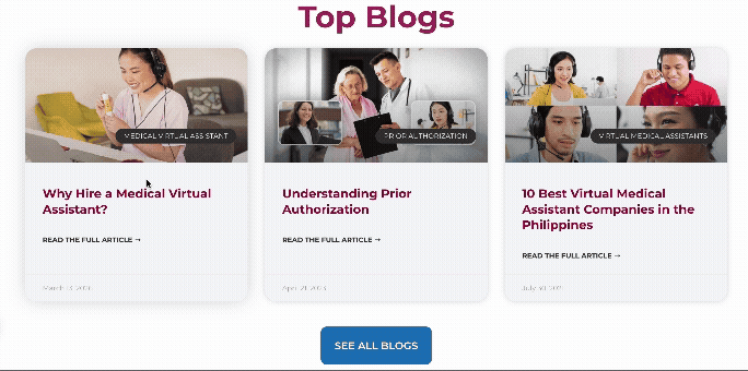
Issue: Several clickable elements, including buttons and navigation items, do not provide hover states or other interaction cues. This makes it difficult for users to identify which elements are interactive and reduces confidence when navigating the interface.
Recommendation: Introduce clear hover states (such as color changes, elevation, animations, or cursor changes) to provide immediate feedback and improve the overall sense of responsiveness within the interface.
Error Prevention
Finding: Incorrect office address displayed under the Philippine location.
Issue: Users may be misled about the physical location of the office, potentially resulting in unnecessary travel or difficulty contacting the correct branch.
Recommendation: Correct the address and clearly separate location-specific office information to prevent user confusion.
Make Third-Party Recognition More Visible
Problem
Press coverage was buried under the Newsletter page.
Insight
The company already had valuable third-party recognition, but visitors weren't likely to encounter it naturally.
Recommendation
Move selected press coverage to a prominent "As Featured In" section on the homepage.
Expected Impact
Help first-time visitors quickly recognize the company's external credibility and build greater trust.
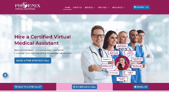
To evaluate the website holistically, I conducted a heuristic evaluation and visual UI review to identify usability, interaction, and design issues. I also identified opportunities to strengthen the experience for new visitors, including recommending that third-party articles featuring the company be surfaced on the homepage to provide prominent social proof and establish credibility.


bottom of page